Sample essays
Band 5.5 IELTS essay: the 4 mistakes that capped the score
A band 5.5 essay scored 5/6/5/6, plus the exact sentence holding each criterion down and the minimum fix that clears the band 6 line.
10 min read
A full IELTS Task 1 pie chart answer scored 6/7/6/7, showing why band 6.5 is arithmetic rather than a descriptor — and the three edits that make it a 7.
A band 6.5 is never a descriptor. No criterion is ever scored 6.5 — it is what comes out when two of the four criteria land on 6 and two land on 7, and the whole question is which two. This article takes a complete pie chart answer, marks it criterion by criterion, and shows that the two sixes here are Task Achievement and Lexical Resource, neither of which is fixed by writing more.
The charts, the question and the answer were all written for this article — no real exam material is reproduced, and the figures are not real statistics. Marking is against the public Band Descriptors (Updated May 2023). IELTS does not publish examiner-marked band 6.5 chart answers, so this is not an official sample; it is an answer scored against the published wording.
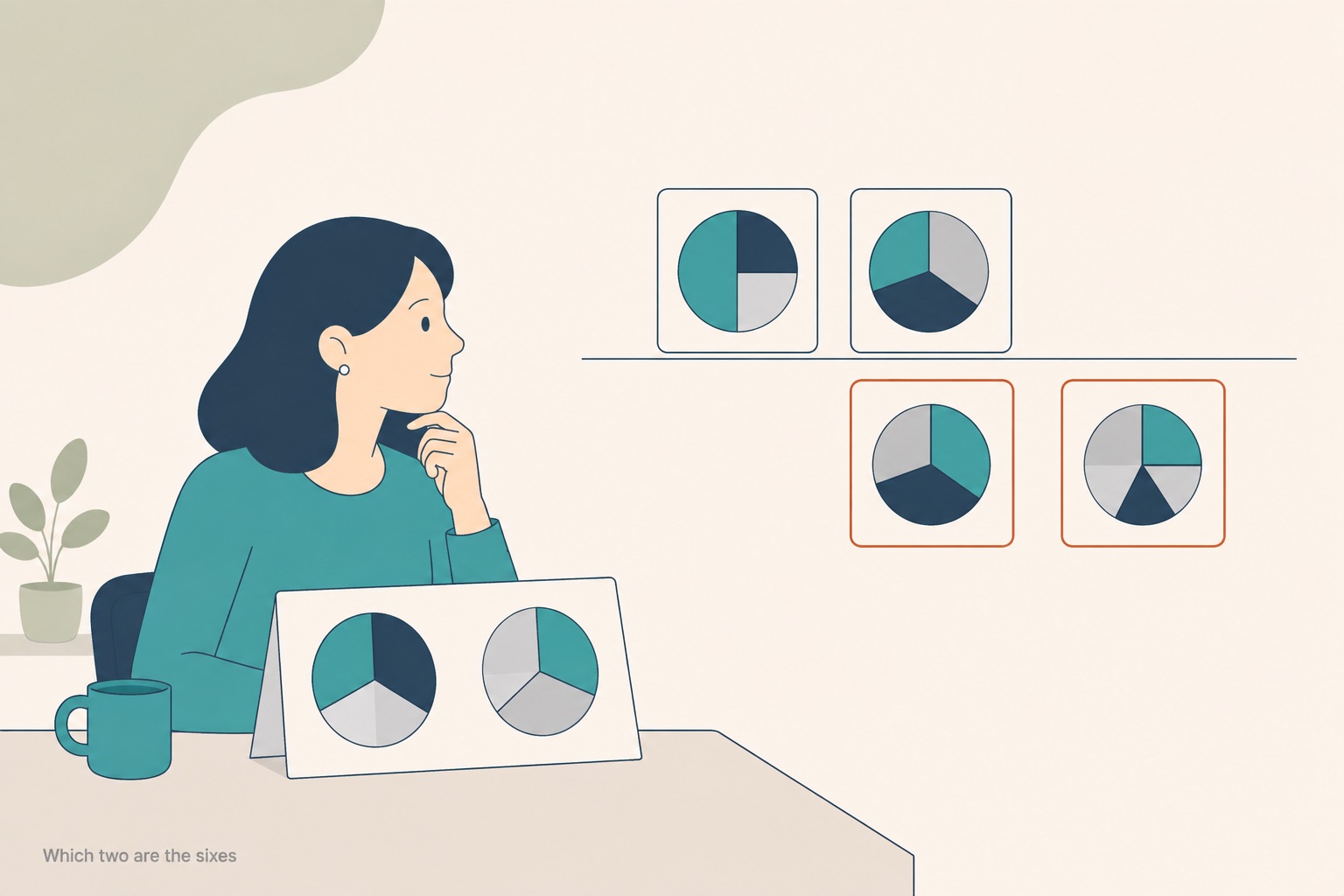
A 6.5 is two sixes and two sevens. Everything depends on which two are the sixes.
The charts below show household spending by category in Country X in 2005 and in 2020. Summarise the information by selecting and reporting the main features, and make comparisons where relevant. Write at least 150 words.
Rather than reproduce the two circles, here are the figures they carry, so you can check the answer against them yourself.
| Category | 2005 | 2020 | Change |
|---|---|---|---|
| Housing | 28% | 34% | +6 |
| Food | 24% | 17% | −7 |
| Transport | 16% | 14% | −2 |
| Leisure | 12% | 15% | +3 |
| Healthcare | 9% | 13% | +4 |
| Other | 11% | 7% | −4 |
Both columns total 100%, and the rises (+13) and falls (−13) cancel out, as they must on a percentage chart. Two things in that table decide the band: housing and food move in opposite directions and account for most of the shift, and leisure overtakes transport between the two years.
The two pie charts show the percentage of household spending in six categories in Country X in 2005 and in 2020.
Overall, there were some changes in the way that households spent their money over the fifteen-year period, although housing remained the biggest category in both years.
In 2005, housing accounted for 28% of total spending and food accounted for 24%, so these two categories together made up more than half of the total. Transport was the third largest category, at 16%, while leisure accounted for 12%. Healthcare accounted for 9% of spending and other categories accounted for the remaining 11%.
In 2020, housing increased to 34%, which was the largest increase of any category, and it remained in first position. Food decreased to 17%, and transport decreased to 14%. Leisure increased to 15% and healthcare increased to 13%, while other categories decreased to 7% of the total.
Therefore, housing, leisure and healthcare increased over the period, whereas food, transport and other categories decreased.
That answer is 164 words, against a published minimum of at least 150.
| Criterion | What the band 7 line asks for | What this answer does | Verdict |
|---|---|---|---|
| Task Achievement | "It presents a clear overview, the data are appropriately categorised, and main trends or differences are identified." | The overview is attempted but says only that there were "some changes" and that housing stayed largest — it names no direction. The two body paragraphs are organised by year, so nothing is categorised by behaviour. Leisure overtaking transport is missed. | 6 |
| Coherence and Cohesion | Logical organisation, clear progression, a range of cohesive devices used with some flexibility. | Four clear paragraphs, one per job, with a signalled overview and a closing summary. While, whereas and therefore are each used correctly, and the closing sentence gathers the two directions of change rather than restating the list. | 7 |
| Lexical Resource | Enough range for some flexibility and precision, with some awareness of collocation. | Accounted for appears five times, and increased and decreased four times each. No word distinguishes a 2-point fall from a 7-point fall. Accurate, but one register of change vocabulary reused throughout. | 6 |
| Grammatical Range and Accuracy | A variety of complex structures, frequent error-free sentences, good control of grammar and punctuation. | A non-defining relative clause (which was the largest increase), two subordinated contrasts, correct comma use around them. No errors. | 7 |
Only the Task Achievement wording above is quoted from the published descriptors. The other three rows describe what those criteria ask for rather than quoting them, because the verbatim wording for Coherence and Cohesion, Lexical Resource and Grammatical Range at band 7 is not reproduced here.
The band 6 Task Achievement line is what this answer actually meets: "Key features which are selected are covered and adequately highlighted. A relevant overview is attempted." Attempted is the operative word. There is an overview, it is in the right place, and it does not say what happened.
The four criteria are weighted equally, so the Task 1 score is their average:
6 + 7 + 6 + 7 = 26, and 26 ÷ 4 = 6.5.
Two sixes and two sevens is the only combination that produces this particular 6.5, and it is worth noticing what it implies: the writing itself is at band 7. The sentences are controlled, the paragraphs are ordered, the grammar is clean. What is at 6 is the reading of the chart and the range of words used to report it. That is why "write more" and "use more linkers" are the two pieces of advice least likely to help here.
There is a second arithmetic point that matters more than most candidates realise. The reported Writing band comes from Task 1 and Task 2 together, with Task 2 counting twice: (Task 1 + Task 2 × 2) ÷ 3, rounded to the nearest half band. Take this answer at 6.5 alongside a Task 2 essay at 7.0:
Fixing this Task 1 answer, on its own, would have changed nothing. Now hold Task 1 at 6.5 and lift Task 2 from 6.5 to 7.0: (6.5 + 13) ÷ 3 = 6.5 becomes 6.83 → 7.0. That is a real half band. Task 1 is worth fixing because the same two habits — a directionless overview and one register of change vocabulary — usually show up in Task 2 as well, not because Task 1 moves the score on its own.

Three edits, no extra length. Two of the four criterion scores move.
None of the three adds length. The answer stays at roughly 164 words.
1. Put a direction in the overview. There were some changes commits to nothing. Replace it with what the table shows: Overall, spending shifted away from food and miscellaneous items towards housing and healthcare, with housing remaining the largest category throughout. That single sentence carries a direction, a cause-side and an effect-side, and the one thing that did not change — and it is the difference between an overview that is attempted and one that is clear.
2. Group by behaviour, not by year. Year-by-year paragraphs force the reader to do the comparison. Grouping does it for them: one paragraph for the categories that grew (housing +6, healthcare +4, leisure +3), one for those that shrank (food −7, other −4, transport −2). This is what "the data are appropriately categorised" is asking for, and it makes the comparisons the task requires unavoidable rather than optional.
3. Let the vocabulary carry the size of the change. Food decreased to 17% and transport decreased to 14% describe a seven-point collapse and a two-point drift in identical words. Food fell sharply, from 24% to 17% and transport slipped by two points cost nothing and mark the difference. While rewriting, catch the swap the answer missed: leisure passed transport to become the third largest category by 2020.
Those three edits move Task Achievement from 6 to 7 and Lexical Resource from 6 to 7. Nothing needs to be added to the answer, and nothing about the grammar changes.
Is 6.5 a band descriptor I can look up?
No. The published descriptors define whole bands only. A 6.5 is always an average of four whole-number criterion scores, which is why asking "what does band 6.5 look like" is less useful than asking which two criteria are sitting at 6.
Do I have to mention every segment of the pie?
No rule requires it. The task asks you to select and report the main features, and selection is itself part of what is marked — reporting all six categories with equal weight is a common way to bury the two that matter.
Which tense should I use?
The chart decides, not a rule. Two dated charts in the past take past tenses; a projection takes future forms. Which tense for IELTS Task 1? works through it.
How long should the answer be?
At least 150 words, in the 20 minutes IELTS recommends for Task 1. There is no published maximum, and there is no published penalty scale for length beyond the stated minimum.
Is there an official band 6.5 pie chart sample?
No. The examiner-commented samples IELTS publishes do not cover this task type at this band, so any answer labelled "official band 6.5 pie chart" — including this one, which is not — has been scored against the published descriptors by someone other than an examiner.
Official task instructions are on ielts.org.
Bandly grades your essay or letter against all four criteria and shows the gap to your target band, sentence by sentence.
A band 5.5 essay scored 5/6/5/6, plus the exact sentence holding each criterion down and the minimum fix that clears the band 6 line.
The same IELTS Task 2 essay at band 6 and band 7, with every edit tagged to the criterion it moved — and the averaging trap that keeps you at 6.5.